Stewarding Your Creative Time Well
When we use our creative gifts for ministry, every moment matters. The time we spend creating handcrafted stationery and greeting cards to share the Gospel and encourage others is precious. Yet how often do we find ourselves stuck in indecision, staring at our supplies, trying to figure out which colors work together?
You know that moment when you’re ready to create, your supplies are spread out in front of you, and then you freeze? You pull out a few card stock options, second-guess yourself, put them back, and try again. What should be purposeful creating becomes a time-consuming guessing game.
I lived in that frustration for years. Then I realized that good stewardship means organizing my creative process so I can focus on what truly matters: the message I’m sharing through my work.
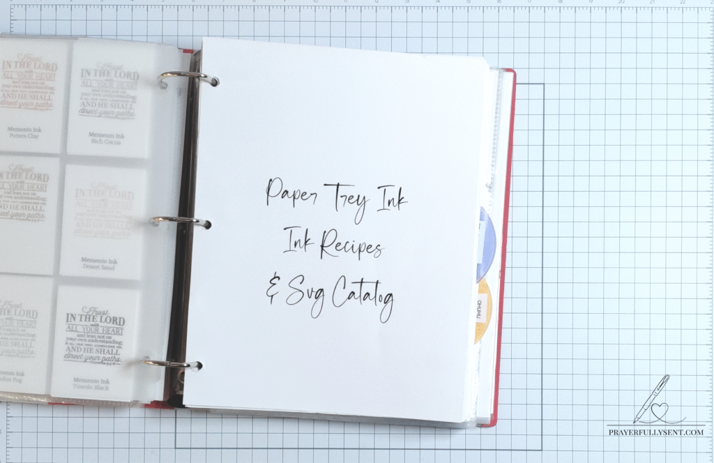
My Original System: The Binder Method
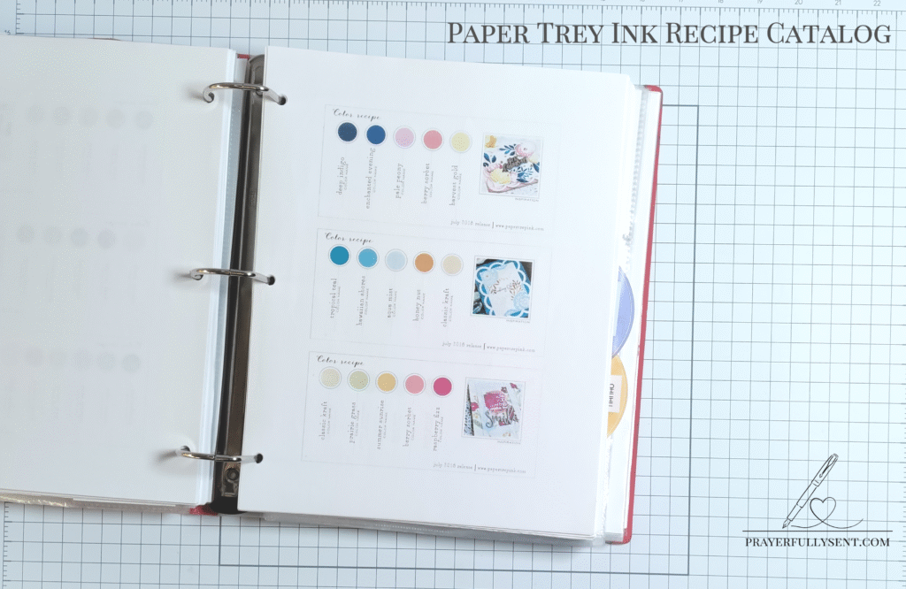
I’ve been a Paper Trey Ink card stock fan for a long time. PTI has always been generous with sharing color recipes on their blog. These recipe cards show beautiful color combinations using their card stock, complete with design tips and techniques. I discovered these treasures in their blog archives and immediately saw their value.
I printed every single file I could find and organized them in a binder. Over time, I built an extensive collection, with multiple color combinations on each page. That’s a quality line up of color recipes at my fingertips!
For years, this binder system served me well. I even bookmarked these recipes digitally so I could color coordinate my Silhouette Studio palettes. I did the same thing with my Tsukineko Inks. Everything I have is color coordinated on purpose to maximize my time and effort.
But here’s the thing about a binder: you still have to flip through pages. When you’re in the middle of a project and need to make a quick decision, flipping through an extensive collection isn’t exactly streamlined.
The Inspiration That Changed Everything
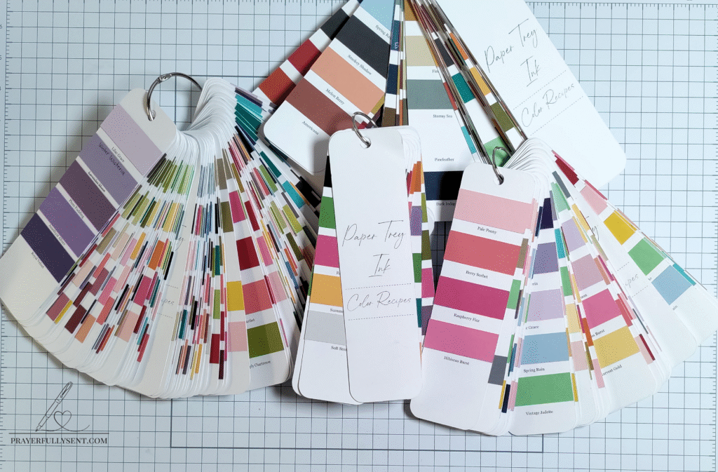
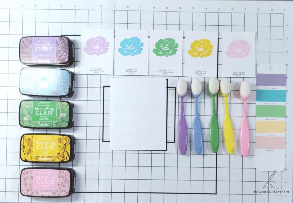
Then I saw a swatch book concept that changed how I thought about organizing color combinations. Individual swatch cards organized on rings that you can fan through quickly, see all your color combinations at a glance, and even hold up directly to your projects to see how they look together.
I was inspired immediately. This was exactly what I needed for my PTI color recipes!
I waited, hoping PTI would create their own version of a swatch book system. But they didn’t. I was disappointed, but then I realized something: I own a Silhouette machine. I could create this myself.
Early in my crafting years, I chose to invest in an electronic die cutting machine because of my husband’s military service and travel weight limits. This investment was the best choice for my family and me during that time. Since then, I’ve continued to use electronic die cutting machines, and they’ve become an integral part of how I create.
Building My Custom Solution
Here’s how I brought this vision to life:
Step 1: Gathering My Resources
I already had the PTI color recipe cards saved and organized. These became the foundation of my new system. Each recipe card shows color combinations that PTI designers have tested and used in real projects.
This project took a few weeks from start to finish, but the time investment has been worth it many times over.
Step 2: Creating the Digital File
Using Silhouette Studio, I designed a print and cut file that would work as swatch book cards. The beauty of creating my own file is that I can customize it exactly how I need it. I can make as many as I want, update them when PTI releases new colors, and organize them in whatever way makes sense for my workflow.
Step 3: Print and Cut
I printed the front cover for each of the PTI Swatch booklets as well as each of the PTI palette names and used the print and cut feature on my Silhouette to create the swatch book cards. Then I cut actual PTI card stock swatches to attach to each bookmark. This was important to me because I wanted to see the true colors, not just a printed representation.
Step 4: Organization
I organized my swatch books into categories that make sense for my creative process. While I initially created these without labels (I was just playing around and figuring out the system), the categories I envisioned were:
- Lights
- Darks
- Florals
- Pastels
- Neutrals
These five categories cover all the bases and make it easy to quickly grab the right palette for whatever I’m creating.
Step 5: Creating Two Sizes That Work Together
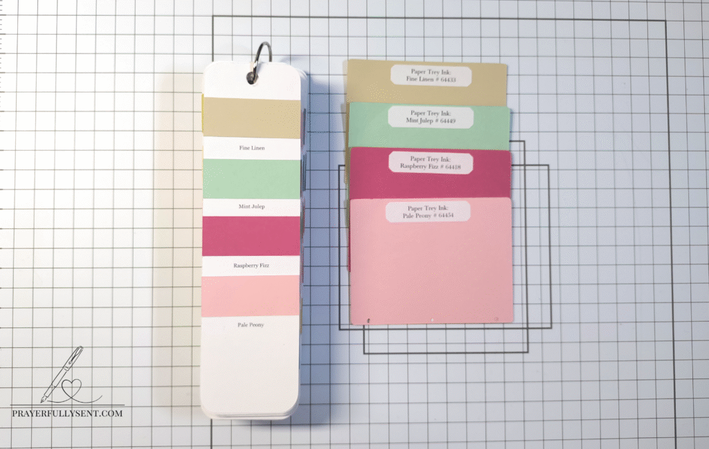
I created two sizes of references to work together. The swatch bookmarks on rings are perfect for quick browsing and comparing multiple color recipes at once. But for larger projects where I need to see how colors work with fabric, watercolor, or mixed media, I also cut 3×4″ cards of each PTI color and labeled them with the color name and number.
These larger swatches give me a true sense of how the color will look in my finished piece, whether I’m planning a greeting card layout, coordinating fabric for a project, or selecting colors for painting. Having both the ring-bound bookmarks for quick reference and the larger cards for detailed planning means I have the right tool for whatever creative work I’m doing.
Why This System Works
This color swatch system has become an essential tool in my art studio. While I created it specifically for card making with PTI card stock, I actually use it for almost everything I create in my studio. Here’s why it works so well:
It’s Visual: Instead of flipping through pages in a binder, I can fan through the swatch cards on their rings and see multiple options instantly.
It’s Tactile: I can hold the actual card stock swatches up to my projects, compare them side by side, and make confident decisions. The larger 3×4″ cards are especially helpful when I’m working on painting, mixed media, or fabric projects where I need to see more of the color at once.
It’s Organized: Categorizing by lights, darks, florals, pastels, and neutrals means I can grab exactly what I need without sorting through irrelevant options.
It’s Customizable: Because I created it myself with my Silhouette, I can add to it whenever I discover new color combinations or when PTI releases new colors.
It Saves Time: What used to take 10-15 minutes of deliberation now takes less than a minute. I grab the appropriate ring, fan through my options, and I’m ready to create.
Stewardship Through Organization
The best part about this system isn’t just the organization itself. It’s the freedom it provides to focus on what truly matters. I don’t second-guess my color choices anymore. I trust the combinations because they’re tested PTI recipes. I can focus my creative energy on the message I’m sharing through my work rather than getting stuck in the color selection phase.
When we’re called to use our creative gifts for ministry, systems like this become acts of faithful stewardship. Every minute I’m not deliberating over colors is a minute I can spend creating something meaningful to encourage someone or share the Gospel.
Making It Your Own
If you’re a PTI card stock user, you can create this same system for yourself. The color recipe cards are available in PTI’s blog archives for personal use. If you have a Silhouette or other cutting machine, you can design your own swatch book cards.
The key is finding a system that works for your workflow and your supplies. What matters most is that you have a way to organize your color combinations so they’re accessible when you need them.
Moving Forward with Purpose
Sometimes the best tools are the ones we create ourselves. Instead of purchasing something new, I took inspiration from a concept I saw and combined it with resources I already had. The result is a system that streamlines my creative process and allows me to be a better steward of the time and gifts God has given me.
If you’re currently struggling with color combinations or spending too much time deliberating over which colors work together, I encourage you to build a system that works for you. Whether you use my approach or create something entirely different, having your color combinations organized and accessible will transform your creative process.
Your time is valuable. Your creative gifts are precious. Build systems that honor both.
Continue Your Creative Journey
Looking for more ways to organize your creative space and streamline your process? Visit the Artisan Search Guide to explore tutorials organized by category, technique, theme, and materials.
I’d love to hear from you! How do you use your creative gifts for ministry? What systems have you created to make your creative time more purposeful? Share your story in the comments below.
Blessings to you in Christ Jesus, my Lord,
Filed under: Art Studio Organization, Painting and Mixed Media, Stationery and Greeting Cards
Comment Policy – Grace Notes & Brush Strokes
As a biblical Christian, I strive to represent Christ and His Word accurately in all that I share. This blog is a space for truth, encouragement, and Christ-centered creativity. If you are a follower of Christ, you are part of His Body, and it pleases the Lord when we walk in love and unity, especially for the sake of those who are unbelieving.
Please keep all comments respectful, edifying, and aligned with the Spirit of Christ. Unkind, divisive, or dishonoring remarks will be removed.
If you believe I have spoken in error, I ask that you follow the biblical model and reach out to me directly, in love and gentleness (Matthew 18:15; Galatians 6:1), with the same kindness and respect you would hope to receive.
"Let your speech always be with grace…" – Colossians 4:6 (KJV)